Many of us will hear at some point or another how either blue or black is the most respectable ink colour for almost any handwritten correspondence, be it a birthday card or a job application. A more extreme version is that no other colour can be taken seriously. More radical still, some true believers in either blue or black object in particular to the sometimes unavoidable use of the other.


Of course in the land of compromise that is the United States of America, the best-selling fountain pen inks are of a shade popularly known as ‘blue-black.’
But fountain pen aficionados guard a secret.
Dark shades of grey, brown and green are, in truth, the height of sophistication. What’s more, blue ink doesn’t exist. Rather, there are a thousand tones that might variously be classed as blue, or not; revered, passed by unnoticed, or indeed viewed with contempt. Even black inks are not made the same. Some shimmer, others shine, have a matte finish or a pearlescent one.
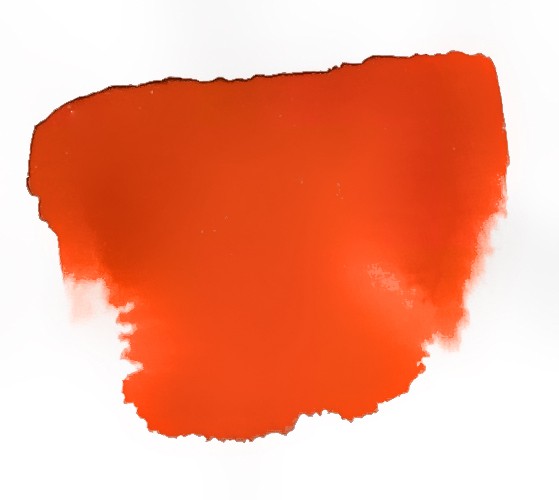
Peach Punch from Diamine
.jpg)
Garland from Diamine
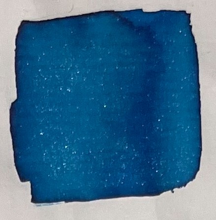
Sub Zero from Diamine
A habitual handwriter can do themselves a favour by discovering the shade that most precisely demonstrates their character, the pitch and cadence with which they should prefer their addressees to read them.
It’s not always an easy task to identify such a colour. There are a range of considerations from the most practical to those rather more elusive, like beauty.
One ought to proceed through a process of elimination in several stages.
First, some practical considerations
For Scanning. Some forms must be filled in using black ink for the simple reason that scanners can more easily pick it up, not to mention that optical character recognition tends to perform better, along with any computer system that attempts to transform documents into processable data. If you work in or adjacent to the legal profession, black is probably the best choice.
For Annotating. Financial auditors and teachers come to mind, but anyone that needs to take a pen and ‘respond’ to an existing text may wish to steer clear of blue or black. This helps readers distinguish their voice from the original. Red is the most popular colour amongst teachers, at least in the Anglosphere. But the younger generation is now questioning this choice: doesn’t red ink stand for a scolding? As for the auditors, green has long been traditional, but much the same as the headteachers’ red, this green strikes fear into the hearts of accountants everywhere:
Why Auditors use green pen ?
If you use blue pen on your documents, accountants will judge you as having the...
Posted by CA. Amar Kumar Pandey on Sunday, 16 August 2020
For Signing. If the most frequent use of your pen will be to apply your signature to printed documents, you can’t go wrong with blue. It will stand out on a sea of black and white, and allay the suspicion that you signed it digitally; perhaps also implying, whether truthfully or not, that you thoroughly digested the text before putting pen to paper.

Fountain pens are just like suits
When we buy smart clothes, we tend to be conscious that colours have almost immutable meanings. Formal menswear has an especially specific code that we can borrow and use as a starting point to think about ink colour:
-
Charcoal Grey - Sober, Businesslike, Mature
-
Navy Blue - Sober, Businesslike, Youthful
-
Black - Bold, Sharp, Serious
-
Medium Grey - Relaxed, “Business Casual”
-
Dark Brown - Stylish, “Business Casual”
-
Tan, Taupe, or Light Grey - Tropical
-
Bright Blue - Casual, Youthful
-
Green, Purple, etc - Bordering on novelty unless paired with the right colours
This guide works pretty well for ink, with a couple of points of divergence around green and black.
The paper you’ll write on, unlike living and working environments, is probably plain and light in colour. As a result, while black is a slightly unconventional choice for a suit, it’s totally conventional for a pen. In fact, the darker the ink, the more universal and versatile.
This also means that while it’s quite challenging to pull off even a dark green suit, the same does not apply to fountain pens. As soon as we reach ‘you could mistake this for black,’ we’re in the highest tier of elegance.
Having said that, green pen also has a reputation in government and media. It’s associated with long, obsessive, eccentric letters sent to politicians and newspaper editors. If you intend to engage in correspondence as a form of influence, perhaps you ought to avoid all shades of green entirely!
Creative applications
Most ink makers also offer some unconventional colours, like pink or yellow. These might not be the best choice for ordinary correspondence or most professional situations, but they’re a great tool in the hands of an artist.
Whenever you’re working with paper that isn’t white or close to it, these bright inks can produce a beautiful contrast. If you want to send a letter that really stands out, a vibrant pen on black paper will do the trick.
If you’re willing to maintain a collection of several fountain pens, you can load a few of them up with these tones and use them for everything from birthday cards to journaling.
Writing the date or title of a journal entry in a loud colour - perhaps a different one for each day - and then switching to a sober tone for the main body can produce a very appealing effect.
At Christmas, you might consider alternating between a bright green and bright red, line-by-line, word-by-word or even letter-by-letter - although switching pens so much can take a while and makes it tricky to write neatly!
More than black and blue
For people new to fountain pens, traditional black or blue might feel like the safe option. But it’s absolutely worth getting a few packs of cartridges in dark brown, grey or similar tones. It’ll add a little extra character to your writing without being garish.
Even if you’re pretty sure it’s blue you want, you should experiment with a few different shades from brands like Kaweco, Graf von Faber-Castell, Caran d'Ache and Diamine. You might be surprised by how much aesthetic variety you can find.